02_magazine
course
vis 207
semester
fall 2021
programs used
adobe indesign, illustrator, + ps
Share


next, we created mock-up magazines. I chose my magazine to be inspired by the sustainability focus and push within the beauty industry coupled with intense capitalism. the goal is to have a conversation about the roles a producer and consumer play in the hyper-consumerist world dominated by material things.
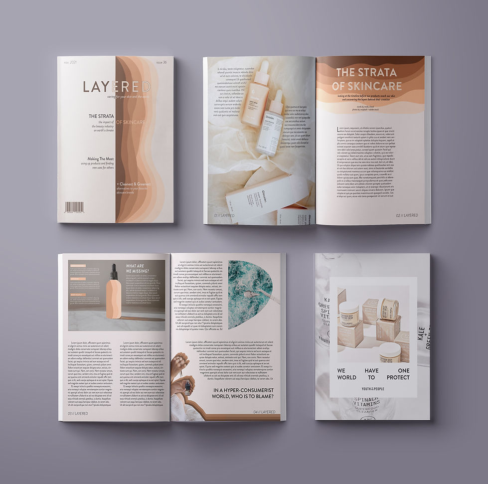


For my magazine, I chose to use my love of skincare and combine it with my interest in the effects of global warming, which I have strengthened using material from an Earth science class on climate change. Just as you layer different products in your skincare routine, there are layers behind the industry in which you are investing, not to mention the layers of the atmosphere being impacted by this industry’s emissions and layers of our oceans being harmed. This is reflected in the feature story, “The Strata of Skincare”, which looks at these impacts. Without putting the blame solely on the consumer, this magazine aims to educate its audience on making mindful choices to support a more green lifestyle as well as spotlight different brands that have commitments to sustainability, such as my ad for Youth to the People.
My typefaces for my magazine consisted of only one, Brandon Grotesque, but I used different styles, such as Regular 12pt for body copy and Bold 55pt for headers. I felt that this font was not only very approachable but also very versatile in its different styles. Attention to the photographs and imagery was of more importance, balanced by this font choice. Deck copy was in Medium Italic 14pt, and I chose to use a Bold Italicized style for the infographic title to make it stand out more.
As for the grid followed throughout each spread, I followed both the page margins (highlighted in purple in InDesign) and four columns and four rows.
Each image chosen and featured in my final magazine had a clean and sophisticated look to them. For example, the photos used in the advertisement were extremely high quality and exemplified the glass and cardboard packaging the brand uses. I also manipulated some images, such as the dropper of serum on the final page falling on a cut out of the ocean, or the hand using a dropper with layered shadows behind her. My magazine also utilized illustrations made in Photoshop of layered skin tones of color, as seen on both the cover and behind the heading of the feature story.
Not only am I incredibly proud of what I was able to create, but I was also able to add it to my portfolio. I have bothered all of my friends and family by looking at my magazine throughout the progress and taking in feedback along the way as you can tell in my process drafts. One thing I learned about design was overall practicing taking a concept (skincare and environmental consciousness magazine) and weaving that story throughout the project visually (ribbons of skin tone colors, “Strata of Skincare”, etc.).
I hope you enjoy my magazine as much as I do